Tuesday, June 25, 2013

Exploring Neighborhood Art

I was thrilled to be a participant in ASID New England's Art Walk a few weeks ago. It was an outing open to the interior design community, and members of local chapters of  IIDA, IFDA, and of course, ASID were invited. The walk led us down Boston's Newbury Street and into 10 of it's most delightful galleries. Prior to this event, I admit to being a little intimidated by the thought of going into a gallery just to look, if I didn't have an actual project - and expense account - in mind.   Now that I have met the friendly and knowledgeable gallery owners, toured their lovely spaces, and got a feel for each one's target clientele, I feel ready to introduce these galleries to my clients and will visit frequently to see what is on display.

Three galleries that I felt resonated most with my tastes are below. Which galleries do you connect with?  I'm interested to hear.

Luc Leestemaker: Beyond the Horizon

33 Newbury Street
617.266.8001
Galerie d'Orsay has a well rounded collection that spans 6 centuries of world renowned master painters, sculptors, and printmakers.


Mary Kocol: Ice Garden

67 Newbury Street
617.267.9060
Naga Gallery showcases mostly contemporary art created by skilled local artists in Boston and New England. They bring us photography, printmaking, and sculpture in addition to paintings. Limited edition studio furniture is also regularly exhibited.


Marc Chagall: Romeo and Juliet

77 Newbury Street
617.369.4800 
Martin Lawrence Gallery prides itself on their expertise in original paintings, sculpture and limited edition graphics, and are dedicating to presenting collectors with the world's best established and emerging artists.


Wednesday, June 12, 2013

How to Arrange a Mantle

It's the million dollar question, and I thought a quick blog post would help refresh even myself on this decorating 101 topic. After all of the holiday decorations have outstayed there welcome, I tend to leave my mantle completely bare, maybe it's some sort of subconscious cleansing after the overload of garlands and wreaths. It's around this time of year where I am ready to see something up there again that reflects the personality of our home.

As with the design and decoration of any space, be sure to keep these buzzwords in mind:
Proportion
Balance
Focal point
Contrast

Here are three of my go-to mantle decorating concepts:


1. Make a statement with a large piece of art. Choose a piece that commands attention and has the right proportion of width and height.


2. Use a collection of smaller art pieces to create a theme motif. The key to making this work is to have varied sizes. It's OK to lean things against the wall and allow them to overlap. It creates interest. Maybe add some blooms or smaller collectibles to soften up the hard edges. You still need something large to ground the mantle, as well as a contrast of shapes, sizes, and colors. Think of it as the launch pad for your personality.


all via pinterest

3.  Create a symmetrical, or balanced arrangement. This is a more classic, or traditional approach, and hard to get wrong. Again, anchor the space with something larger, or visually heavier, and flank it with smaller objects. For example, a mirror with two vases of buds on either side.


There are so many wonderful directions you can take it. Which do you perfer?

Tuesday, June 4, 2013

Before & After: Bathroom Renovation ~ An exercise on Aging in Place

Whether we choose to embrace it or not, it's inevitable: we will all age. There are countless products out there that promise to take wrinkles from your face, or give our metabolisms a jump start, but how often do you think about how interior design can influence the way we age.  Good design can support the aging process by making it easier to carry out the day to day. Thinking ahead isn't being pessimistic, it's being smart.

The bathroom renovation pictured below that I recently completed put to use many key elements of 
design for Aging In Place to address the client's current concerns. 

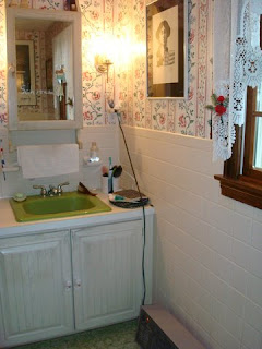
~BEFORE~

Concern #1-Lack of a design concept
My clients were the type who love to be surrounded by their treasures and mementos. As much as I believe in personalization, a bathroom should be a place of calmness and serenity, so creating a design concept that evokes relaxation is a necessity.
Concern #2- Low countertops.
One of the clients is 6' - 4" tall, so leaning over a countertop with a typical height of 29-30" is not  comfortable on his back. I knew we had to raise the height to make it easier for him to use the sink.

Concern #3- Supplemental Heat


The electric space heater on the floor of the bathroom was an element that I knew had to be upgraded. The cord hovering above the sink was a safety hazard. Like many people, my clients enjoy sleeping in cooler air, so this upstairs bath always has cold floors and air temp.  Giving them a warm and cozy bathroom was a must.
Concern #4-Adjustable shower head and skid proof shower floor
  
Our mobility becomes more and more limited as we age, and bathing can be restricted. Having both a hand held and stationary shower head helps to make this activity easier.

~AFTER~

Solution- Concern #1
Once I saw what the client was visually gravitating towards, the organic concept took shape, and we strove to incorporate natural materials.  Can you see the twig-shape drawer pulls we added?

A natural granite was selected for the vanity top. You can see a hint of the twig pull in the lower right of the above image. 
Deco tiles with organic motif embossing were completely unique. No two tiles are the same.
Solution- Concern #2 and 3
Going custom height with a vanity is very simple, and in this case, imperative. We decided to install radiant floor heating, as well as baseboard heat to keep the floor and air toasty. A heat lamp was also a perfect addition for keeping shivers after a shower at bay. My clients commented that the floor and wall tiles felt like and reminded them of sunshine. Using warm earth tones is one way to warm up a space, especially a bathroom where there are many hard surfaces. Tumbled flooring gave an otherwise sterile surface some character.

Solution- Concern #4
Taking the height of my tall client into consideration, we had to have a custom rain shower stem made in order to lift the rain shower head closer to ceiling. The adjustable shower head was updated. River rock flooring in the shower uses more grout, so risk of slipping is eliminated. We also opted to have a step in shower rather than a tub.


What design-concern solution is your favorite?

Tuesday, May 28, 2013

Design Discovery: Diallo Chandelier

I look forward to the day when I will have the opportunity to attend the High Point Market, but in the meantime, I will have to be content living vicariously through the High Point Style Spotters. This season, I am completely smitten with the Diallo Chandelier by Arteriors they highlighted.

The coral inspired design is made of lacquered resin, and can be specified in white with a satin brass canopy and rod, or red with polished nickel. My mind is filled with creative places I could hang this fixture, and I am excited for the ideal client project where I can use it. I have a Rhode Island beach home project starting soon, maybe that will be the perfect one.
images via Arteriors

Where would you like to hang this beautiful globe of coral?


Tuesday, May 21, 2013

Welcoming Spring Indoors

It seems like spring just got here, but summer is already about a month away.

Oversize greenery potted in an urn is an unexpected vertical element in this sleek living room.


It's easy to let seasons come and go, but I enjoy using fresh flowers and greenery to bring some life to our living and working spaces. I have my go tos like tulips and hydrangeas, but possibilities are really endless when creating and lovely arrangements. Below are some of my favorite ways for displaying greenery and blooms to enjoy inside.
Pretty pink peonies in a low bowl
Chevron flooring, a gold mirror, architectural details, and an urn filled with green and white
Recycled glass wall terrarium
Herbs above the kitchen sink


Tuesday, May 14, 2013

Reflecting: Building Lasting Relationships

via design-magnifique.com


My husband recently forwarded me this article from the New York Times, and it got me thinking about relationships with my clients. I found it incredibly interesting, and if you substitute the word designer for contractor, the message is the same.

As with most designers, when working so closely with a client, it's inevitable that we eventually become friends. This article offers some interesting advice, to be mindful to not let frustrating punch list items get in the way of ruining a great project and a great relationship or future referral.  

One contractor I work with once said he was always confused by why his clients ended up "hating" him after months of good work.  But, it is just what the article says - a bunch of minor stuff left undone for a long time until he had a rainy day to come by and button things up.  The same is true for we designers.  

In the article, Dr. Kahneman concluded that people don’t evaluate the pain of an experience on an overall level. Instead, they remember the pain at the very end — and whether it got better or worse.

The end of a project is oftentimes the most crucial point- everything that I've worked so hard to get perfect for my clients can finally come to fruition. It's easy to crumble under pressure and just focus on getting tasks done in order to move onto the next, but care must be had to ensure that the perfection that I strove to work towards at the the onset is carried through to the end.  That is, after all, why our clients put trust in us in the first place.

Wednesday, May 1, 2013

Looking Up: Colorful Ceilings

I was inspired by a blog post about patterned and painted ceilings, and couldn't stop my mind from from dreaming about the possibilities. In my opinion, a white ceiling is classic and refined, but a hint of the unexpected can work wonders for a space that otherwise may need that last detail.

colorchats.benjaminmoore.com
The ceiling above is in William Morris's Red House, built in 1860. Morris was a textile designer, artist, and writer from England, and was one of the founders of the Arts & Crafts Movement, so peeking into this home is like stepping back in time, and witnessing an influential piece of the past. The yellow and white motif is a lovely complement to the diamond mulled windows.

colorchats.benjaminmoore.com

I wanted to show this image above because I am intrigued with the look of painting the trim and ceiling beams in a room as another way to infuse color without putting it on the walls or into the decor. The blue bunk room is so cozy looking,  the deep color and the way the dressers are integrated into the bed platform is another homey touch.


colorchats.benjaminmoore.com


Painting a ceiling dark is for the fearless, but it can create a very successful effect.  A tall ceiling painted black is dramatic and enhances the eclecticism of the space. It makes the walls look as if they are free-standing.  The contemporary artwork above the fireplace, streamlined leather sofa, and gold shaded lamps juxtapose the traditional detailing in the mantel and on the walls.


Houzz

By putting a bold color on the ceiling, bright bedding and an upholstered headboard can pop off a neutral wall, like in the image above, and no sunglasses necessary. (You are getting a little peek of one of my favorite pendants at the moment, too.)


Houzz

Have you ever wondered why porch ceilings are painted blue?  I once read it was so bees would confuse the ceiling for the sky, and would be less likely to build a hive. Who knew? Although this soft blue is inside, it certainly gives a light and airy feeling to the foyer. I've been debating painting my living room ceiling a similar color, so it's wonderful to see how it works above. I think it would look great above my new chair.